Tuesday, February 13, 2018

Las Vegas Outlaws of the XFL Reimagined -- Do Over

A few months ago, Phil Hecken from the website Uni Watch put out a call for readers to reimagine what the XFL would look like today if the #XFL hadn't folded. This was also a contest, in part, to the rumors (which are now true) that Vince McMahon was bringing the XFL back to life.

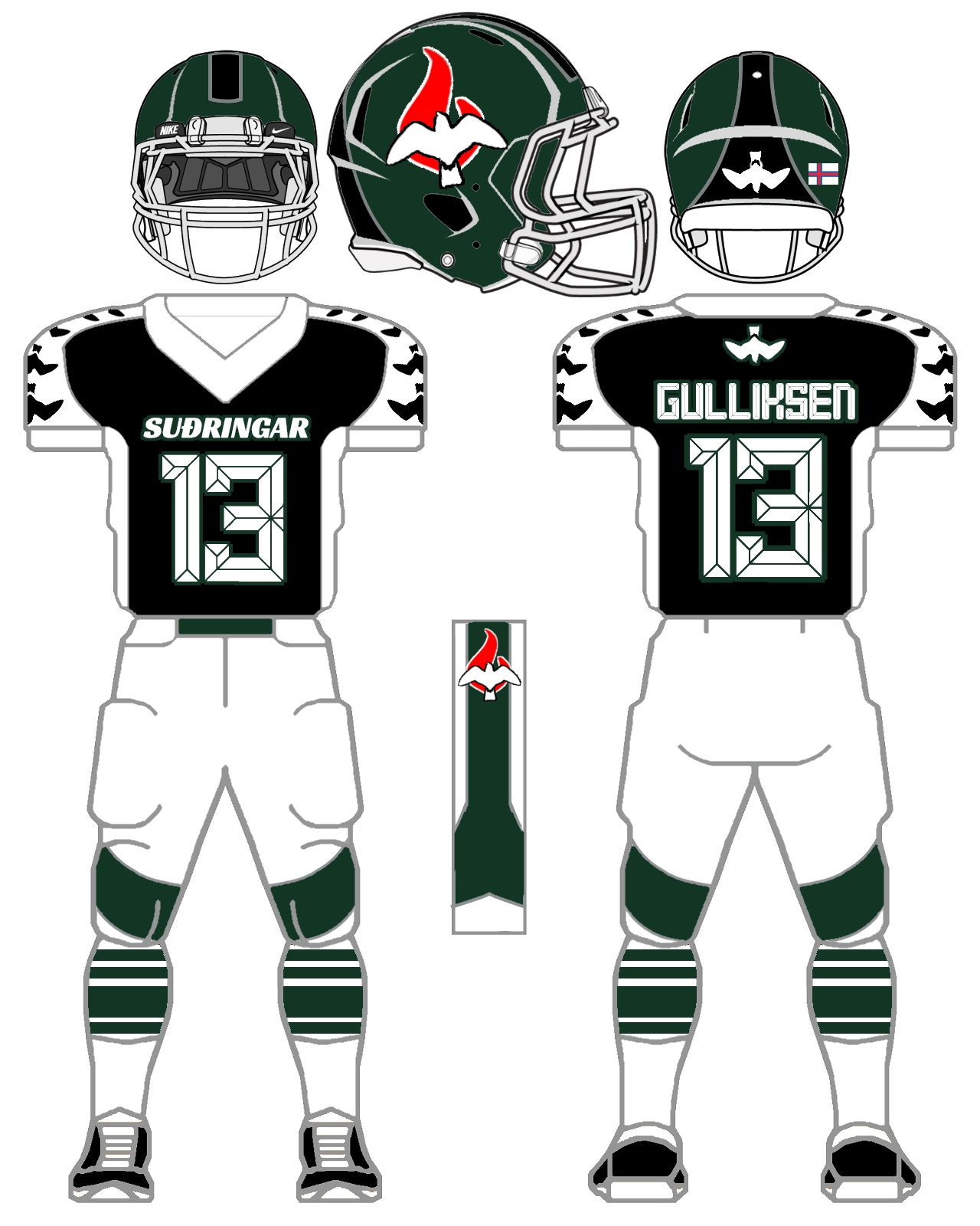
Well, I entered the competition with a concept that mixed both the Letter Fronted uniform concepts with pattern sublimation. It is a simple/clean look yet didn't push many boundaries and didn't gain much traction among readers. 
 
There were some realllllly awesome concepts which you can find here (Part I) and here (Part II)  with the winner determined here (THE FINALS)

To be honest, I was a big fan of the Geometric patterns applied to Aaron Jaffe's design.

Here's my entry:


Now, I was fairly disappointed that I kept it so safe. That is my M.O... but I decided to go back and give it another whirl. I went into unsafe territory. I tried to design some patterns which all turned out bad. Then I realized I had downloaded a cool design called Shiny Red Wave Background from Freepik by concepter Harryarts. I then went to Spoon Graphics and found some awesome Topographical patterns to add a... LendaSport feel to the design. I also found some inspiration looking through the Paladin Sport catalogue.  I also used a base from #GarbAthletic for all of my designs since they are the ones who partnered with #UniWatch for this contest.

Yeah, I am admitting my sins which doesn't absolve me of anything. Yet my finished product is part curiosity and part... WHY DID YOU DO THIS?!?!?!

The Font I used is from PixelSurplus called Ridgeline with some spurs thrown into the Numbers from the Rebel Bones Font.


Thursday, February 8, 2018

Futbol as Football Series: Khan Research Laboratories

Futbol as Football Series: #KhanResearchLaboratories of the #PakistanPremierLeague (now defunct) of #Pakistan

This is a big #ThankYou to all the folks who have visited the blog from #Pakistan over the past few months. 

Many thanks to all of you!

I chose #KRL because I could barely find any up-to-date photos of other clubs on the web and they have won the league several times. So I chose #TheKhans as my squad to cross over from #futbol to #gridiron #football.

They have a pretty cool square pattern on their current (?) jumpers that I wanted to keep for the #AmericanFootball jersey. I decided to make an approximation of this pattern into a "rhomboid" stripe in the vein of #Northwestern's and the #USNavalAcademy's 2016 around-the-trunk design. I also did a "reduced" concept using this rhomboid stripe as #IndianapolisColt stripes on the shoulders. I used this stripe as side panels on the "reduced" concept of the "Generic Template" and not on the "Real World". Plus, I incorporated this design into the squads' helmet.

I decided to use BodyHype's, a #Quebec, #Canada outfit, Bruzier template for my "Real World" concept. They outfit a few squads in the #FFFL, such as the #ThononPanthers, and are quite good masters of sublimation. (Love the #ThononPanthers' kits).

Fonts used - Numbers - Boxise, Names - Berg Regular


Saturday, January 20, 2018

Futbol as Football Series: TB FCS Royn

Futbol as Football Series: #TBFCSRoyn from the #Effodeildin of #FaroeIslands

A big Takk Fyri #THANKYOU  #TAKKFYRI to the folks who have visited the blog from the Faroe Islands!

This is my second club design from our friends from the North Atlantic and this club caught my attention due to the origin of the squad. It is a merger (2017) between three teams from #Suðuroy Island: #TBTvøroyri, #FCSuðuroy and #RoynHvalba. From the team's Wikipedia Page:

The name is too long to use, so the media started to use the word Suðuroyarliðið in stead, which means The team from Suðuroy and the supporters and the chairmen have agreed upon using the word Suðringar, which means People of Suðuroy.
It is not uncommon in the United States for communities or small High Schools, especially in rural communities in North & South Dakota, Montana, Idaho, etc., to "join forces" in order to fields a Grid Iron team. 
Examples: Mayville-Portland-Clifford-Galesburg (#NorthDakota), Clark Co/Watersprings (#Idaho), Grass Range-Winnette (#Montana), Lingle-Fort Laramie (#Wyoming)  I understand this happens quite often in Club Futbol around the world and looked like a great project to take on. 

I decided to see what history/wildlife I could use as a visual image for Suðuroyarliðið for the squad's livery. Also, the team's uniform outfitter, Hummel, played a big part of what I went with for the visual identity of the club. I used one of the nesting birds that calls the island home, the European Storm Petrel, as a mascot. I combined the Petrel and the flame from the clubs current crest as a logo. To top it all off I got to use the color Phthalo Green (#123524) in the squad's color palate.

I went with a curved shoulder stripe/yoke and a colored side panel for my mock ups. On the "Generic" mock up, I used a really unique stripe-to-knee loop. I used Petrels in place of the Hummel chevrons on the shoulders and the back of the helmet. When I saw the plain uniform it was missing something - a "texture". I went with the M84 Camo pattern used by the #DanishMilitary.  The main reason I'm using this for my uniform isn't necessarily in homage to the military but more for bird watching/hunting. How do you get close to a wild animal to observe & take pictures? Camouflage/Ghillie Suits/Bird blinds. 

Also to give the kits a more unique flavor. For my "Real World" concepts I went with #AlphaPerformance's V8 Jerseys and Elite pants.

Fonts used: Numbers/Name on Back - alt smaq 6.8, Team Name on Front - Racing Sans One.


Monday, January 15, 2018

Futbol as Football Series: PSPS Riau (PSPS Pekanbaru)

Futbol as Football Series: #PSPSPekanbaru / #PSPSRiau from the #Liga2 of #Indonesia.

Another big ole #THANKYOU for the folks from Indonesia who have visited the blog over the past few months.

While I was searching through the leagues for a team to possibly transpose from #Futbol team to #Football team, I came across the Wikipedia page from the Askar Bertuah (Lucky Warriors) and noticed their other nickname:

THE SUMATRAN TAPIR!

It was then ON like Donkey Kong! I immediately thought of the logo for the #ArkansasRazorbacks (one which i LOVE) and had to try to recreate the Hog into the Tapir. I haven't been able to draw a lot due to an injury I sustained (ahem - did to myself) to my hand back in August which has prevented me from drawing a lot. 

I didn't get a decent 1:1 recreation, yet I think I did an okay job.

#PSPS have had some nice kits over the years and I made a mix of an older jersey (which you can see at their facebook page) with their latest jumper from #CLCS. They have some neat designs on their home/away kits and I HAD to incorporate it into my mockups. Instead of having the yoke/stripe on the front of the jersey I swapped it to the back with a color patch on the back just like the Malaysian Tapir.  I also incorporated their Uniform Badge (with an American Football instead of a futbol).

This became a FUN jersey to create. For my Real World mock-up, I went with #SeigeSports who do the #USNFT (US National Football Team) U19,17,15 squads. I happened to come across a photo for the #USNFT U19 squad in preparation for the International Bowl (19s beat #TeamNordic, the 18-select lost to #UANLAutenticoTigres). Now, some of Siege's designs aren't my favorite, yet they have some pretty nice concepts/designs that do look wonderful! I went with their S3 template and I hope you enjoy.

Fonts used: Old School Athletic.


Wednesday, January 10, 2018

Futbol as Football Series: Ansan Greener FC

Futbol as Football Series: #AnsanGreenerFC  from the #KLeagueChallenge of #SouthKorea.

Not only is this squad brand new to K League Challenge, they're brand new...

PERIOD!

First year squad, Ansan Greener Green Wolves, finished 9th out of 10 in Challegne and have a handsome kit created by #Kelme. 

I dig the Mountain adorned chest #Chevron and kept it for the chest symbol of my generic/Real World mock-ups. I also added it to the shoulders. I also reduced the team's crest for the uniform. I placed the Chevron in the background in the same vein as #AdelaideUniversity #BacktheBlack's chest V.

I used #GeelongSportsAuthority's template for their "Fire & Ice" kits and kept the pattern from the generic concept for the Real World design.

Fonts used: Numbers - Zing Rust, Team Name - 210 Trigger B, Name on Back - 김제시체M, Helmet Stripe - Combo of Lemon/Milk & Keep Calm, Helmet symbol - North 


Wednesday, January 3, 2018

Futbol as Football Series: Gyeongnam FC

Futbol as Football Series: #GyeongnamFC  from the #KLeagueClassic of #SouthKorea.

This is a BIG HOWDY DO to the folks who visited the blog from South Korea!

We've had quite a few folks fly into the blog from the ROK and here is one of a couple of concepts that I've chosen to do as a thank you.

The Roses were recently promoted from #KLeagueChallenge (2nd on South Korea's Futbol pyramid) to K League Classic. They have a beautiful kit from #Hummel with a nice two-part #sash on their home and away kits. 

I thought about putting a sash on my Football concepts (See Vasco de Gama Patriots from #Brazil), yet I thought this was a chance to use their kits as inspiration to make something new. While in the process of doing so, I also took inspiration from the Hummel chevrons to make a unique pinstripe/pant stripe. 

This became a unique look that is part #TexasA&M/part #NewYorkYankees. 

I did this for both the generic and "Real World" mock-ups.

For my "Real World" mock-up, I didn't go with Alpha Performance like I did last time. They are capable of sublimation/screen printing, though I went with #Sportek and their template which they created for the #ZemunPirates which fit well with my "generic" design. 

Fonts used: Numbers - Bohem Press, Name on Back - 210 Bananakiwi B, Name on Front - Nexeon Football Bold.