Saturday, August 6, 2016

Futbol as Football Series: AS Riviere du Rempart


Futbol as Football Series: AS Riviere du Rempart from the Mauritian League.

This is a shout out to our lone visitor from the island nation of  Mauritius!


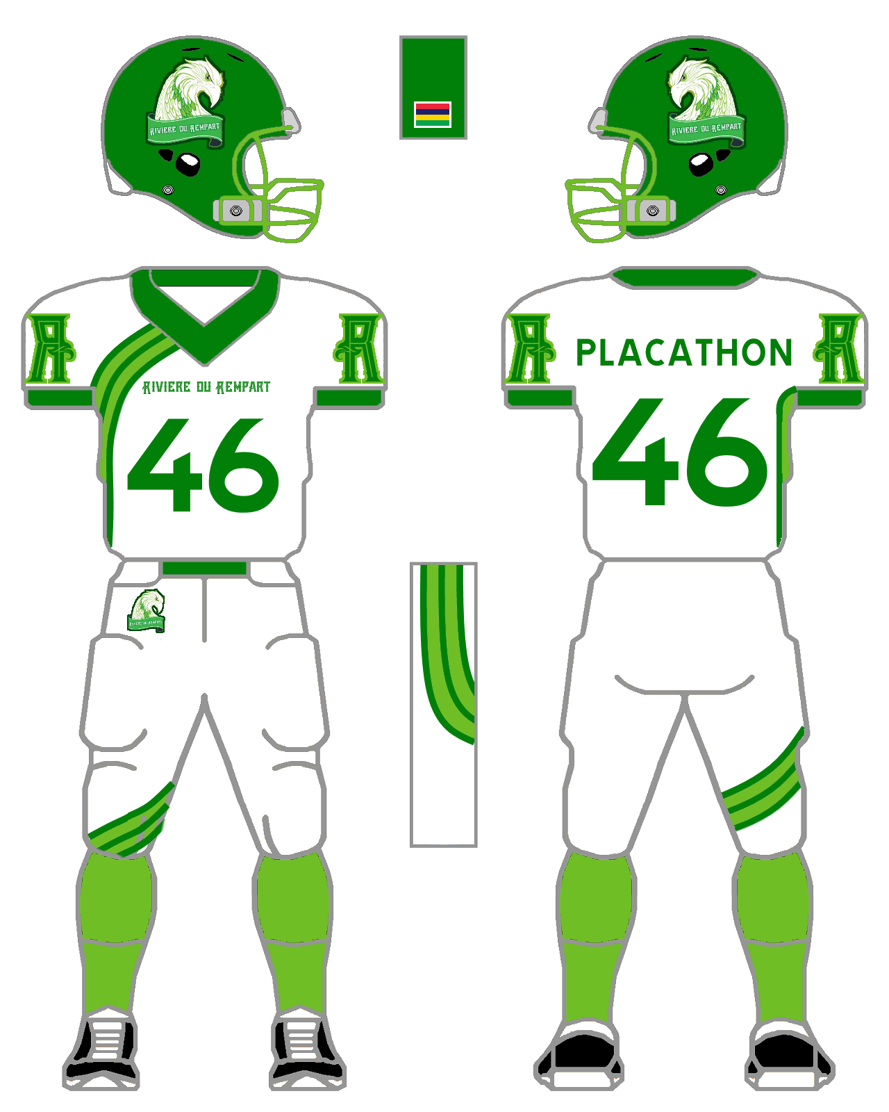
I was searching through the teams within the Top Flight of Mauritian football and I came across the the Young Eagles which looked like a fun squad to concept! I converted the squad's badge into what you see to your left for the Helmets.


This one has taken me quite a bit longer to do than most concepts. When I discover a team to do I always have a Real World template to convert my designs into. I couldn't find a uniform manufacturer for Riviere's kits so I went with an  underutilized football manufacturer Healy. With each manufacturer I use, I try to convert their designs into Tim E O'Brien's football uniform template.


For my generic design I decided on an Asymmetrical pattern for something completely different!  This proved my choice of Healy to be on point! Healy has a few asymmetrical designs which I think you can take my pattern and convert it easily. Heck, Healy has options for sublimated uniforms which makes the sky the limit to what you want to do.


In order to get my Real World design you would have to adapt Healy's Bulldog/San Leandro and Riders jersey templates with WIldmill/Thunders/Rempart/Anbock Pants. Hey, Healy - you can call this the Rempart!


Fonts used: Converted helmet symbol/team name on front: Atara, Name on Back
/
Numbers: TratexSvart.


Monday, July 18, 2016

Futbol as Football Series: Lincoln Red Imps

Futbol as Football Series: Lincoln Red Imps from the Gibraltar Premier Division.

I settled on the Red Imps after their upset win over Celtic FC. So, in a way, this is a bandwagon concept.

I based Lincoln's helmet design on the 1950s UNC Tar Heels/1940s Rams. Just after I had designed the helmets I realized that a friend of mine, the Big Kahuna from the AAIFA, had created a design for his Detroit Demons' concept helmet using these decals at one point.

I hang my head in shame.

Okay, I'm back to normal.

The Imp from Lincoln's badge is neat, yet I felt it didn't work for this concept. I searched around the net and went to one of my sources for free clipart, clker.com, to see what I could find. I found a neat little imp and felt his normal horns weren't enough for my final product. I didn't want to do something exactly like my Avenir Beggen Pixie design, yet I knew a helmet needed to be part of the mascot's look. I searched the web for 1950s helmets and came across UNC's 1954 lid.. When I added it to the Imp, the horns, the helmet, and the puckish smile all worked well together!

I kept Lincoln's vertical stripes for the "Generic Kit Concept", and they have a unique look compared to my other striped offerings. 

Since the Red Imps are outfitted by Joma, I stayed consistent with my crossovers and gave Riddell a go for the "Real World" strip. I noticed that Lincoln's away jumper has a stripe that comes from the underarm gusset to the collar. I went with Riddell's Performance 25 jersey and added Chevrons instead of vertical stripes. Just looked better in this setting. I used Wildcat 10 pants to finish out the look.

Fonts used: Numbers/Names: Doeregon, Name on front: Peterbilt. 


Tuesday, July 12, 2016

Futbol as Football Series: Undrið FF

Futbol as Football Series:  Undrið FF from the 2. deild in the Faeroe Islands.

I came across Undrið while taking a gander through teams in the Faeroe Islands. The squads in the Premier League and 1. deild didn't quiiiiiiiiiite catch my attention.

Then I saw Undrið, clicked on the link and not only did the badge catch my attention, but their badge from 2006-2010 (??) made me want to do a concept for this team.

It is TOUGH to find images for the squad's current futbol kit. I came across a video and some game footage from their Facebook site to get enough information to take a go at a concept.

I reworked their 10th anniversay badge into what you see above for a helmet emblem. I took the broken lines from the emblem and turned them into Temple style uniform stripes. I was having difficulty figuring out what to do for the sleeve caps and went with the stripes similar to the pant stripes. I'm kicking myself for not having TV numbers on the shoulders. Now, in retrospect, I can see that would add something to the design. For my Real World concept I went with the Nike Mach5 design.

Fonts used: Aldo the Apache for the numbers and Team name on front, XXII Don't Mess With Vikings for the Name on Back.


Friday, July 1, 2016

Futbol as Football Series: AEK Larnaca

Futbol as Football Series: AEK Larnaca from the Cypriot First Division.

Admission off the bat: I misspelled Larnaca on the jerseys! I'm usually good about checking and double checking names, yet this time I'm messed up!

I'll try to get an update on that as soon as possible.

We had a guest from Cyprus a few months ago and it's about time for me to tip my hat and do a squad from the third largest island in the Mediterranean. 

The Green-yellows were runner-ups last season in First Division and have represented Cyprus well in Europa competition. 

AEK, formally known as Athletiki Enosi Kition Larnakas, gets their name from the ancient Greek City-State of Kition. 

Here's a brief history on the origin from wikipedia:


The colours of the club are yellow and green and their emblem is admiral Kimon, who died at the seafront defending the city of Kition (modern Larnaca) in a major battle in Cyprus at about 450 BC, in a fight against the Persians. He had told his officers to keep the news of his possible death secret. The quote "Και Νεκρος Ενικα" ("Even in death he was victorious") refers to Kimon.

Larnaca (sorry folks about the misspelling) are decked out by Puma wearing their traditional Green and Yellow with black and white alternate strips! As an American/Canadian football uniform supplier corollary, I went with Under Armour Auburn Jerseys with Run and Gun Pants for my "Real World" concepts. I didn't change much from the "Generic" to the "Real World" designs because I didn't want to....

<childish folding of the arms>

Which leads to the question: When I do an UnderArmour futbol team, will I go with UA?

Fonts used: Komikazoom for the Names and Numbers, Australia Titile for the city name on front.

On a side note: My old high school uses the USC Trojan for their symbol (they're known as the Warriors). I mean, if they're going to use USC's symbol, why not AEK's or Spartak Moscow's Hockey symbol? 

That's it... I'mmmmmma hafta do another mock up for my old high school! 


Update 2 July 2016: I got off my duff and fixed 'em!


Thursday, June 23, 2016

Futbol as Football Series: FC Stal Dniprodzerzhynsk (Kamianske)

Futbol as Football Series: FC Stal Dniprodzerzhynsk (now Kamianske) of the Ukranian Premier League.

We've had a few guests to our blog from the Ukraine and this is my tip of the hat to them!

The team has undergone a MAJOR overhaul to their Badge and to their livery. If you look at the English Wikipedia and Russian Wikipedia entries for the Steel you will see their old crest. Going to the Ukranian Wikipedia page and the team's "Not Under Construction" website, you will see the new crest and the new uniforms from Joma on display.

This is a time where Nike, the team's former kit manufacturer, didn't have the better design for the squad.

Joma, on the other hand, has done a bang up job for the Steelworkers! And for my "Real World" design I chose Riddell to be the ones to outfit Stal. I went with Riddell's Cowboy Jersey option with their CLEM 10 pant design. Riddell has a MASSSSSSSSIVE colleciton of templates to choose from and you can choose from the simple, the tight, the trendy, to sublimation. 

That is the one reason it has taken me so long to get a new concept out: just recreating all the Riddell forms for my adaptation of Tim E O'Brien's templates.

For my "Generic", I tried to make a hybrid of both the Navy Jersey (with small, double hoops down the kit) and the white uniform (with a Navy and Sky yoke combination). This is one of the few times where I think I did a better job with the generic over the Real World. Plus, in order to keep up with C+ - I decided to add a tight yoke to my game.

Fonts used: Name on Back: Platiea, Numbers: Bender Inline, Team Name on Helmet/Front: Impact.

I'm kinda medicated right now so I'll edit this sunuvagun in a few. 


Thursday, June 9, 2016

Futbol as Football Series: Santiago Wanderers of Valparaiso

Futbol as Football Series: Club de Deportes Santiago Wanderers from the Chilean Campeonato Nacional.

This is a hello to the visitor we had from Chile and also in recognition of the Wanderers' cool Badge/Lettermark.

The club has fairly simple kits with the 2016 home being forest green sporting a sublimated diamond pattern, and the away is grey with pinstripes.

In my "generic template" designs I tried to replicate both the diamond (for sublimated shoulder pattern) and pinstripe for the body of the jersey. It maybe tooooooo much.

I admit it....

For the "Real World" designs I went with templates from Russell. Macron are the Port Men's kit manufacturer and for an American/Canadian corollary I went with Russell. Some of Russell's designs are not my favorite. They have some nice simple options yet it seems they've over designed some of their other templates. The jersey template (I'll get you the specs later on) can be a rough one if done wrong and looks decent if done right. They have a lot of sublimation options at their disposal and I intigrated my take on the Wanderer's diamond pattern for their sleeves. I kept the hooped socks and went with no stripes on the helmet.

Fonts used: Numbers: Squares Bold, Name on Back - Marty for "uinones" and Shibuya for the Q, Team/City name on front - Homestead Regular.