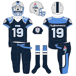
Futbol as Football Series: FC Stal Dniprodzerzhynsk (now Kamianske) of the Ukranian Premier League.
We've had a few guests to our blog from the Ukraine and this is my tip of the hat to them!
The team has undergone a MAJOR overhaul to their Badge and to their livery. If you look at the English Wikipedia and Russian Wikipedia entries for the Steel you will see their old crest. Going to the Ukranian Wikipedia page and the team's "Not Under Construction" website, you will see the new crest and the new uniforms from Joma on display.
This is a time where Nike, the team's former kit manufacturer, didn't have the better design for the squad.
Joma, on the other hand, has done a bang up job for the Steelworkers! And for my "Real World" design I chose Riddell to be the ones to outfit Stal. I went with Riddell's Cowboy Jersey option with their CLEM 10 pant design. Riddell has a MASSSSSSSSIVE colleciton of templates to choose from and you can choose from the simple, the tight, the trendy, to sublimation.
That is the one reason it has taken me so long to get a new concept out: just recreating all the Riddell forms for my adaptation of Tim E O'Brien's templates.
For my "Generic", I tried to make a hybrid of both the Navy Jersey (with small, double hoops down the kit) and the white uniform (with a Navy and Sky yoke combination). This is one of the few times where I think I did a better job with the generic over the Real World. Plus, in order to keep up with C+ - I decided to add a tight yoke to my game.
Fonts used: Name on Back: Platiea, Numbers: Bender Inline, Team Name on Helmet/Front: Impact.
I'm kinda medicated right now so I'll edit this sunuvagun in a few.


