Wednesday, March 30, 2016

Futbol as Football Series: KVC Westerlo

Futbol as Football Series: KVC Westerlo of the Belgian Pro League

First order of business, The Rooster  that I used is from mmagician catch fire which you can find at Deviant Art. Westerlo's mascot is De Kemphaans (the Ruffs) and they have a cool drawn rooster that represents the team well. 

It just didn't work well for a helmet symbol. 

So I scoured the internet for something that would work as well and I found mmagician's hand drawn caricature and added color. 

Westerlo uses a Saller kit with a sublimated halftone pattern around the collar. I've experimented with a halftone design on an RPG Football team I have and when I saw the design of Westerlo's kits I knew I had to give it a go.

The standard template is what I would probably pattern their American/Canadian uniforms after if I had my choice. It is the closest representation to what Westerlo wears which is in step with part of the intent of my experiment. I patterned the top of the shoulder stripe after the USC Trojans with heavy use of TV numbers on the sleeve.

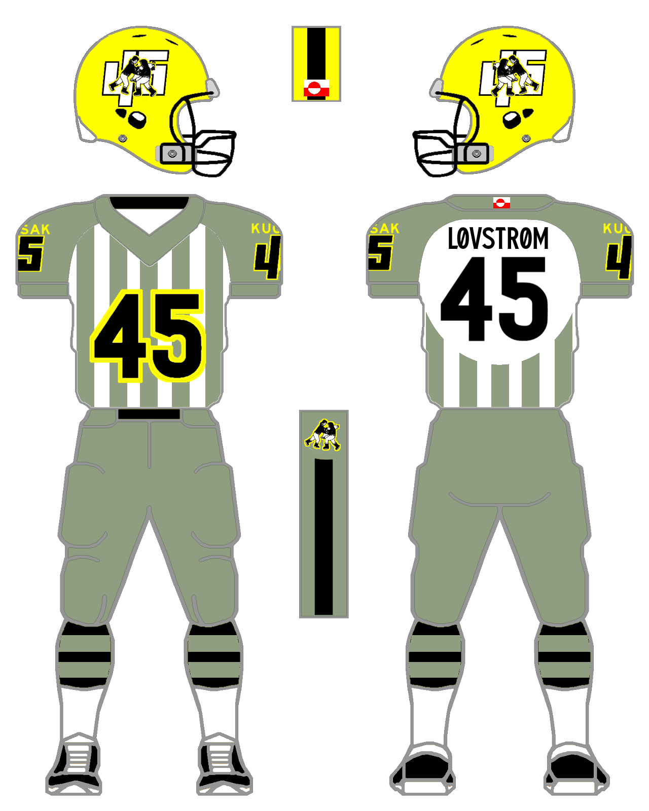
Now, for my "real world" concept, Georgia Tech's 2009 uniforms seemed to be a design that could house the Westerlo look. I know it may not be everyone's cup of tea, but with the neck scoop piping, shoulder inserts and such, it seemed to be what would work for The Ruffs. I searched through the Russell catalog and found an interesting pant design that I felt would give this concept a bit more... pizzazz?

Font used: Carbon Bl by Typodermic Fonts


Sunday, March 27, 2016

Futbol as Football: IF Elfsborg

Futbol as Football Series: IF Elfsborg from the Allsvenskan in Sweden.

The main reason I chose the Elegant Ones is their wordmark and added it to the helmet. Since I dig cool wordmarks on helmets like Duke's old helmet, Maryland's Terp helmet, Colgate's lid, and Pitt's helmet, I made it happen for this concept.

I am definitely going to revisit a few more squads from Allsvenskan with squads known as the Wasps and the Iron Stoves - I've gotta step up my game!

Elfsborg has a very traditional livery and I tried to keep things simple for the Yellow Ones. I did my standard badge-on-the-sleeve and placed the fan flag on the front of the jersey. Instead of keeping the Nike logo on the uniforms, I decided to go with Umbro because that is Elfsborg's kit manufacturer. Nike and Umbro used to be under the same flag before Nike sold Umbro to Iconix in 2012. 

That was good enough for me to use Nike templates for an Umbro squad. 

I combined the collar design from the 2015/16 with the black collar insert from the 2014/15 jersey. I also kept the side panels and incorporated them into the pants stripe. OH! I retooled the leaves from the badge for the helmet stripe. 

I made an all red kit in homage to the club's history of being a last minute substitution for the Finnish National team who had to pull out of a match against Sweden's 11. Since both Sweden and Elfsborg both wear yellow, the Elegant Ones had to borrow a red kit from a local squad in order to compete. Elfsborg won 2-1 and the red change kit has become a part of their livery. I also created a black change kit when needed and to keep with the American/Canadian model of one white/light, one dark in the basic team colors.

Font used: Cubadak


Thursday, March 24, 2016

If you have any suggestions, feel free to let me know!

I know I'm not the greatest designer in the world, yet this has been a fun project for me to play around with converting Futbol (Soccer) kits into American Football Uniforms. If you have any suggestions on teams or what have you, feel free to drop me a line in the comments section!

Tuesday, March 22, 2016

Futbol as Football: Fortuna Düsseldorf 1895


Futbol as Football Series: Fortuna Düsseldorf from 2.Bundesliga in Germany.

F95 has a pretty simple badge with the F fitting the mold of the Belton Tigers, Arlington Martin Warriors and other teams who employ a similar stylized lettering on their helmets (at least two you can see here at the Texas High School Helmet Project).

Reason Number 2 that I chose Fortuna: they had checkered sleeves on their kit from last year! This year they have a red with dark red striped first kit going with white sleeves and yoke from Puma. 

Reason Number 3: This is a tip of the hat to the folks who have visited the blog from Germany. 

I'm going to try to do other squads from different countries who have visited us, just give us some time :).

I went with an Under Armour template for a "realistic" look. Here in the States, the top three football uniform manufacturers are Nike, Adidas and Under Armour. Puma is probably number two (just a guess) in Europe (3 maybe), so with that I decided to outfit F95 in a top tier uniform manufacturer. 

And if you could follow my logic through that last bog of psuedointellectualism , kudos to you!

Fonts used: Numbers/Names on back: Droid Sans, Fortuna 95 - Red World.


Friday, March 18, 2016

GAA as Football: Kerry County GAA


GAA as Football Series: Kerry County of Ireland's GAA  

(I will clean up the Crown C, promise!)

This is my tip of the hat to the folks who visited the blog from Ireland over the past few weeks. 

This isn't Futbol; it's Gaelic Football and Hurling as American Football! 

I have minimal exposure to both sports through Youtube Highlight videos. The closest full-length game I've seen that compares to GAA is the International Series between the Australian Football and Gaelic Football All-Stars. 

Gaelic Football uses a round ball and incorporates (sorry if I'm off base) futbol, rugby, and some similar rules to AFL. Big hits, big scores and big celebrations!

What more could you ask?

I tried to use a crest from the league which I could easily incorporate into helmet/shoulder symbols (cause I've been kinda busy lately and I wanted to do something simple - I'M SORRY, OKAY! I'll probably take another crack at a GAA squad in the near future). There are many neat elements in their crest which I have added into parts of the uniform. I took the Crown C from the word mark and made it into the helmet sticker! OOOOOOOO - look out Chicago Bears! I incorporated the word mark and placed it on the chest of the jersey. I used the Stag and Fern for the shoulder emblems and put the Ship and Rock as hip symbol and back of jersey mark. I borrowed the Northwestern jersey idea for the front and back of the uniform and added the O'Neill's three stripes to the shoulders. For the "realistic" template, I used Tim E O'Brien's Adidas True Fit template (since Adidas and O'Neill's both use the triple stripe).

Kerry GAA's nickname is "The Kingdom of Kerry" and I'm kicking myself for not having that written on the inside collar. 

I may do that at a later date.

Fonts used: Mixolydian Titling for the NOB and the 5 with DANDH (from rail-sim-stuff.com) for the 1.


Futbol as Football Series: Daegu FC


Futbol as Football Series: Daegu FC from South Korea's K-League Challenge.

Since I did a squad from the DPRK, I thought it would be fitting to also do a team from the Republic of Korea, ie South Korea. There are some cool squad badges and wordmarks which I felt would make great helmet stickers. My first foray into the K-Leagues comes a squad that needed very little tweaking to make their crest work. 

I'm not quite sure what Daegu FC's mascot is, yet their badge symbol is fantastic in my humble opinion. 

You'll notice that I am using two different templates for teams right now. The main one (simpler) is a template you can find at the Gridiron Uniform Database. They employ a universal template for ease of use. I have also been trying to show how the uniforms will look using different styles such as the Nike Hypercool template (which I found at Chris Creamer's Sportslogos.net forums), Adidas' TechFit, UA or even NewBalance, Russell, etc. This is to give you both a uniform feel and a realistic look.

Fonts used: Number: Homestead Inline, Name on Back: Droid Sans Fallback, Hangul Daegu FC is Typo_SsangmunDong.


Thursday, March 10, 2016

Futbol as Football Series: West Sydney Wanderers

Futbol as Football Series: West Sydney Wanderers from the A-League of Australia.

This one goes out to the folks from Oz who have recently visited my page! The A-League has some squads with epic designs such as the Melbourne Victory, Brisbane Roar and the West Sydney Wanderers. If you check out old school Gridiron photos there are a few squads who wore hoops on their jerseys. One squad that comes to mind is the early 1900s Arkansas Cardinal (Razorbacks). Currently, Northwestern and Navy have stripes across the midsection of their tops and I decided to experiment with full jersey hoops for the Wanderers' concept. I know I've had stripes on other concepts, and it shouldn't be much of a difference, yet I went with WSW and their trademark hoops. If there is a difference between vertical stripes and hoops, please let me know!

Also, the Interlocking WSW from their badge screams helmet sticker! And, man, does it work on an American Football Helmet!! I also created a subdued version relegating the hoops to just shoulder stripes which you can see at the bottom.   

Fonts: Number/Name on Back: Vincent. Wordmark: Typographica


Sunday, March 6, 2016

Futbol as Football Series: Kugsak-45


Futbol as Football Series: Kugsak-45 of the Coca-Cola Greenland Men's Football Championship (GM).

I was looking around another youtube channel when I came across the Greenland Men's Football Championship. The league intrigues me because quite a few of the squads play their matches on dirt fields. If you want an analog here in the States, look at the Juneau Crimson Bears who play their (or used to) games on a lava/dirt field and the Barrow Whalers who used to play on a permafrost dirt field. 

Hardnosed football!

I kept the squad's vertical stripes and, unlike my concepts with Bohemians and Tromso,  I did a blank scoop on the back so you can read the numbers/name on back easily. For the team's helmet stickers I incorporated the community's symbol over "45" written in Yukimoble.  I did go to the Sport Club's facebook page and the to folks on the team's badge are wearing blue and red coats. On the wikipedia site, it is in black and white. My apologies to the Kugsak-45 faithful.

Fonts: Name on Back - Whitby Brewers, Community Name - Freeway Gothic, Numbers - BCRail.