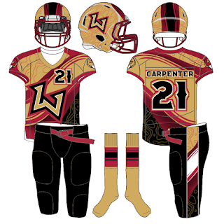
A few months ago, Phil Hecken from the website Uni Watch put out a call for readers to reimagine what the XFL would look like today if the #XFL hadn't folded. This was also a contest, in part, to the rumors (which are now true) that Vince McMahon was bringing the XFL back to life.
Well, I entered the competition with a concept that mixed both the Letter Fronted uniform concepts with pattern sublimation. It is a simple/clean look yet didn't push many boundaries and didn't gain much traction among readers.
There were some realllllly awesome concepts which you can find here (Part I) and here (Part II) with the winner determined here (THE FINALS).
To be honest, I was a big fan of the Geometric patterns applied to Aaron Jaffe's design.
Here's my entry:
Now, I was fairly disappointed that I kept it so safe. That is my M.O... but I decided to go back and give it another whirl. I went into unsafe territory. I tried to design some patterns which all turned out bad. Then I realized I had downloaded a cool design called Shiny Red Wave Background from Freepik by concepter Harryarts. I then went to Spoon Graphics and found some awesome Topographical patterns to add a... LendaSport feel to the design. I also found some inspiration looking through the Paladin Sport catalogue. I also used a base from #GarbAthletic for all of my designs since they are the ones who partnered with #UniWatch for this contest.
Yeah, I am admitting my sins which doesn't absolve me of anything. Yet my finished product is part curiosity and part... WHY DID YOU DO THIS?!?!?!
The Font I used is from PixelSurplus called Ridgeline with some spurs thrown into the Numbers from the Rebel Bones Font.


Those designs are SICK!!...Nick work!!....have any more?
ReplyDelete