Futbol as Football Series: KAA Gent from the Belgian Jupiler Pro League.
This is my second foray into the Belgian top flight for Futbol as Football. Their badge is unique for a European club and I decided to give a redesign a go.
I can't remember if I saw an article about it at Uni Watch or another website. Outside of controversies surrounding Native American Imagery and sports in the United States, the Chieftain looks as if it is a US helmet logo already and seemed a nice fit.
Jartazi , a Belgian uniform firm, designs the Buffaloes' kits. I went with templates from the UK outfit Kukri for my "real world" designs.
I recreated their current kits onto the basic form for my "generic" concept.
I decided to go with a couple-a-different flavors for my "Real World" concepts based on Kukri templates. I combined the football kit's top-o-the-shoulder stripes with Kukri's Stafford kit in two different ways. The first with both sleeve stripes and the second with the sleeve cap stripe only. The second template I went with was Kukri's Djebel combined with my reduced Stafford sleeve striping.
I try to stick with rules based on American and Canadian standards for uniformery (is that even a word?!?!?). With the ones at the top I threw caution to the wind! I took a page from the letter-fronted throwback designs and combined them with the European rules for Basketball and voila - the design you see.
Fonts Used: Name on Back - Russo One, Numbers - TitilliumMaps26L
Welcome to the fun of Futbol as Football the one, the only....<drum roll please>
C+
He's a self proclaimed Jersey Freak from fantastic Newfoundland!
He is one of the toughest competitors from the UWFFL and king of the Shoulder Yoke. This means I'mma hafta step up my shoulder game for my desings!
Get ready for the awesome!
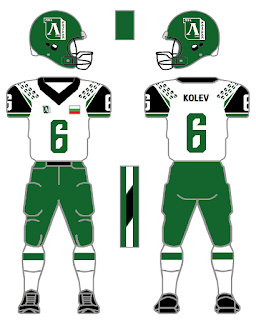
"From the Ludogorie region of wild forests in Bulgaria comes FC Ludogrets
Razgrad of the Bulgarian A Division. Green, white and black.
"Ludogrets
logo on helmet and rt chest. Nicknamed the "Eagles" , coincidentally my
favorite NFL team."
Designed by the one and only C+ !
Futbol as Football Series: FC Fylkir Reykjavik of the Icelandic first division
Stayed with the home colors of orange and black for both home and away
kits. Thought the logo was cool , so placing it center front and on the
helmet.KSI patch to lt chest also.
Designed by the blog's friend C+ !
Futbol as Football Series: FC Astra Giurgiu from Liga I Orange out of Romania.
This is an ode to the folks from Romania who visited the blog. I forgot why I chose Astra and I think it was because of their crest.
The club uses four-pointed stars on their badge and I wanted to emulate that in a different way for the team's identity. I was trying to find a star-styled-halftone pattern and came across Ministry of Type on how to create the pattern I used on the uniform and helmet. I decided to do a kit-from-scratch for the Dracii Negrii based on their basic Puma futbol kit.
(Yeah, it has a Pittsburgh Steelers feel)
I utilized the stripe pattern from Texas A&M and added in a design between the stripes kinda like the Argyle of UNC. I stayed with the uniform combinations instead of mixing and matching like I have with other squads.
Simple does it and simple is how it will go.
I went with UnderArmour as the team's "Real Life" uniform provider. As I have said before: Nike would be number one for number of squads under the swoosh, Adidas number two and UnderArmour a stout 3. With Nike and Adidas already both futbol and Football kit manufacturers, I went with UA in place of Puma since the Big Cat doesn't do American Football uniforms anymore. I chose UnderArmour's Brawler jersey template because it would work well with the shoulder stripes with Auburn templated pants.
Fonts used: Number and Name on Back: Game Sans Serif 7, Team/City name on front: Acknowledgement
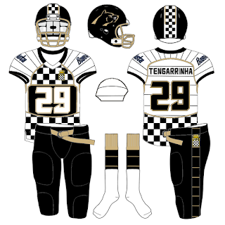
Futbol as Football Series: Boavista FC from the Primeira Liga in Portugal.
I've done teams with checkering (is that a term) before in their identity, yet not where it was a major part of their uniform. I know Boavista's main uniform would not fly in today's NCAA thanks, in part, to the Bib jerseys BYU wore in 1999.
Thanks for ruining the possibilities, BYU!
I still went with it for a First and Third Kit for Boavista.
This is my project and I can do what I want to! (plus I can always do a checkered yoke design for a more standard jersey at a later date)
Boavista's 2014-15 kits are better, in my opinion, than their current set and are the ones I based by concepts on.
Errea is the club's kit manufacturer, and in my search for a possible corollary in the American system I decided on Riddell. Now, Riddell would be considered a step down from Russell and possibly a step up from Wilson in hierarchy of uniform manufacturers (well, in my opinion). They do produce a Viper template uniform that can be fantastic if done well. Riddell is more known for their helmet manufacturing and they do make a mean product. Their uniform templates seem to match up better (or I made them match up) for what I wanted to do with the Checkered Ones. (I also ditched the Old Gold pants I did on the Standard Third Kit and went with Black knickers (see definition 1) for their "real life" set).
In my standard template, the numbers didn't work as well across the midsection as they did with the "real life" template.
I'm okay with that.
I did make concepts with numbers closer to what they wear on their futbol kit in which I will breakout at a later date.
I drew a minimized Panther symbol that wasn't in snarl mode for their helmet. You don't ALWAYS have to have a mean looking caricature for your team symbol (see the 1970s-80s Milwaukee Bucks). People know a Panther means business, so I decided to go for a more regal look for the big cat.
Fonts used: Number: Fatcat, Name on Back: Pocket Knife Marquee, Team Wordmark: Hellfire Club 2.
Update 14 April 2016: The font used on this set is similar to what Boavista wears in real life. The font is called Peppermint if you are wondering.
Futbol as Football Series: Lille OSC from Ligue 1 of France.
This is a shout to the folks from France who visited the blog recently!
Lille's badge uniquely combines a Great Dane with flame (I believe, I might be wrong) to make it look like to big dog is running. I adapted the Great Dane head from their crest for the helmet and the Fleur de Lis for the shoulder treatment. I put a reduced version of the squad's badge on the chest with a team wordmark on the left.
I at first didn't want to add anything to the shoulders because Lille's base futbol kit is fantastically simple. Against my better judgement, I added the badge's Fleur and it works.
I also thought it would be cool to keep the full Dane silhouette for a helmet symbol with Lille written out. I had it stuck in my mind that a wordmark needed to be on the helmet. When I reduced the Dane to just a head and placed it on the helmet just like Kansas State, I saw that it worked better!
One thing about football helmet stickers is simpler is better. I kept my other helmet concept so you could see what I am talking about.
I did a red kit based on their primary strip, a white kit with a reddish gray shoulder coloring called Ford Light Gun Metal Gray, and the team's second kit in Gold, Black and White.
Realistic template is the Nike 51 uniform system. Fonts used: a4 serif for the Name on back, Hyouzi Display 2 for the numbers and the wordmark is Springsteel Serif.


