Tuesday, November 22, 2016

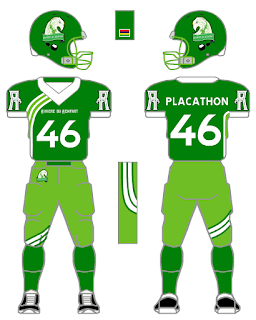
Futbol as Football Series: FK Atlantas

Futbol as Football Series: FK Atlantas from the Lithuanian A Lyga.

This is a big ole "Thank You" to the folks from Lithuania who have visited the blog recently. The next countries I intend to do concepts from are the Philippines and India. I've had quite a few visitors from that neck of the woods and I need to show them some love.

A Lyga has a few cool club crests. Check out FK Lietava Jonava and FC Stumbras for starters. When I came across Atlantas', as you can figure out, I was hooked! 

A SEAHORSE! I haven't worked with a seahorse before and thought this was a perfect fit for my wild mind despite doing Blue and Gold several times before. 

I removed the futbol from their current badge for the helmet decal. I tried to replicate the "ATLANTAS" from the badge for a chest plate and fleshed out the club's Seahorse for a shoulder crest.

I adapted the squad's Jako kit for my "generic template" keeping the company's 5 circle symbol on the shoulders and the pants. I used the club's wave from the crest and placed it behind the Seahorse on the shoulders. 

Last time I did a Jako club I used Rawlings as a corollary. Since I used Rawlings for my last project, and for this concept I went with Wilson. I used Wilson's Corvalis template for the jersey and their FCP39 for the pants. 

Fonts used: NOB/Atlantas - Baron Neue Black, Numbers - Titr.


Monday, November 7, 2016

Futbol as Football Series: Maccabi Netanya FC

Futbol as Football Series: Maccabi Netanya FC of the Israeli Liga Lemuit.

This is a tip of the hat to the folks from Israel who have visited the blog!

I based this choice on the diamond from the club's badge. Their current kit is from Diadora which is simple, basic and neat.

Yet their togs from the 2015/16 campaign from Lotto has a cool gradient striping on the front which had me at "CLICK HERE"! 

On the basic template I tried to emulate this effect on both the jersey and the pant. This could be done easily in the real world.

For the Real World correlation I chose Rawlings as a comparable correlate. The jersey is an ISO Custom Jersey/Missouri Template with Digital Wave pant.

Fonts used: Numbers - Craze, NOB - Stopmotion, Team name on front - Nehama. 


Tuesday, October 25, 2016

Futbol as Football Series: FK Jagodina

Futbol as Football Series:  FK Jagodina from the Serbian First League.

It's been a WHILE and now I'm climbing back into the saddle with another concept. This is a tip of the hat to a guest we had from Serbia a few months ago.

If you have seen a pattern in my designs, or rather what teams I concept, I sometimes go for neat designs, unique liveries, or cool nicknames.

FKJ goes by two nicknames. The Blues and the Turkeys.

GAME ON!

Legea produces the current Jagodina kits which sport a three part sash similar to the Under Armour treatment of Tottenham Hotspur. For my "Real World" concept, I went with Alleson as a corollary using their Highlight template alongside their Stripes program to make it happen. (There is another template I mixed with the Highlight for a standard game day look which I'll get for you later).

For the Turkey, I went back to Deviant Art and used Sammy Jae's "Tribal Turkey" which you can find here: http://sammyjae.deviantart.com/art/Turkey-156737773.

I'll get you the fonts used later.

Update 25 October 2016: The normal game day jersey is based on the Championship Stripes/Highlight Jersey. The pants are JDF18's and the fonts used are: Affogato for numbers and name with Magnolia for the team name on front. 


Saturday, August 6, 2016

Futbol as Football Series: AS Riviere du Rempart


Futbol as Football Series: AS Riviere du Rempart from the Mauritian League.

This is a shout out to our lone visitor from the island nation of  Mauritius!


I was searching through the teams within the Top Flight of Mauritian football and I came across the the Young Eagles which looked like a fun squad to concept! I converted the squad's badge into what you see to your left for the Helmets.


This one has taken me quite a bit longer to do than most concepts. When I discover a team to do I always have a Real World template to convert my designs into. I couldn't find a uniform manufacturer for Riviere's kits so I went with an  underutilized football manufacturer Healy. With each manufacturer I use, I try to convert their designs into Tim E O'Brien's football uniform template.


For my generic design I decided on an Asymmetrical pattern for something completely different!  This proved my choice of Healy to be on point! Healy has a few asymmetrical designs which I think you can take my pattern and convert it easily. Heck, Healy has options for sublimated uniforms which makes the sky the limit to what you want to do.


In order to get my Real World design you would have to adapt Healy's Bulldog/San Leandro and Riders jersey templates with WIldmill/Thunders/Rempart/Anbock Pants. Hey, Healy - you can call this the Rempart!


Fonts used: Converted helmet symbol/team name on front: Atara, Name on Back
/
Numbers: TratexSvart.


Monday, July 18, 2016

Futbol as Football Series: Lincoln Red Imps

Futbol as Football Series: Lincoln Red Imps from the Gibraltar Premier Division.

I settled on the Red Imps after their upset win over Celtic FC. So, in a way, this is a bandwagon concept.

I based Lincoln's helmet design on the 1950s UNC Tar Heels/1940s Rams. Just after I had designed the helmets I realized that a friend of mine, the Big Kahuna from the AAIFA, had created a design for his Detroit Demons' concept helmet using these decals at one point.

I hang my head in shame.

Okay, I'm back to normal.

The Imp from Lincoln's badge is neat, yet I felt it didn't work for this concept. I searched around the net and went to one of my sources for free clipart, clker.com, to see what I could find. I found a neat little imp and felt his normal horns weren't enough for my final product. I didn't want to do something exactly like my Avenir Beggen Pixie design, yet I knew a helmet needed to be part of the mascot's look. I searched the web for 1950s helmets and came across UNC's 1954 lid.. When I added it to the Imp, the horns, the helmet, and the puckish smile all worked well together!

I kept Lincoln's vertical stripes for the "Generic Kit Concept", and they have a unique look compared to my other striped offerings. 

Since the Red Imps are outfitted by Joma, I stayed consistent with my crossovers and gave Riddell a go for the "Real World" strip. I noticed that Lincoln's away jumper has a stripe that comes from the underarm gusset to the collar. I went with Riddell's Performance 25 jersey and added Chevrons instead of vertical stripes. Just looked better in this setting. I used Wildcat 10 pants to finish out the look.

Fonts used: Numbers/Names: Doeregon, Name on front: Peterbilt. 


Tuesday, July 12, 2016

Futbol as Football Series: Undrið FF

Futbol as Football Series:  Undrið FF from the 2. deild in the Faeroe Islands.

I came across Undrið while taking a gander through teams in the Faeroe Islands. The squads in the Premier League and 1. deild didn't quiiiiiiiiiite catch my attention.

Then I saw Undrið, clicked on the link and not only did the badge catch my attention, but their badge from 2006-2010 (??) made me want to do a concept for this team.

It is TOUGH to find images for the squad's current futbol kit. I came across a video and some game footage from their Facebook site to get enough information to take a go at a concept.

I reworked their 10th anniversay badge into what you see above for a helmet emblem. I took the broken lines from the emblem and turned them into Temple style uniform stripes. I was having difficulty figuring out what to do for the sleeve caps and went with the stripes similar to the pant stripes. I'm kicking myself for not having TV numbers on the shoulders. Now, in retrospect, I can see that would add something to the design. For my Real World concept I went with the Nike Mach5 design.

Fonts used: Aldo the Apache for the numbers and Team name on front, XXII Don't Mess With Vikings for the Name on Back.